Menu
Close


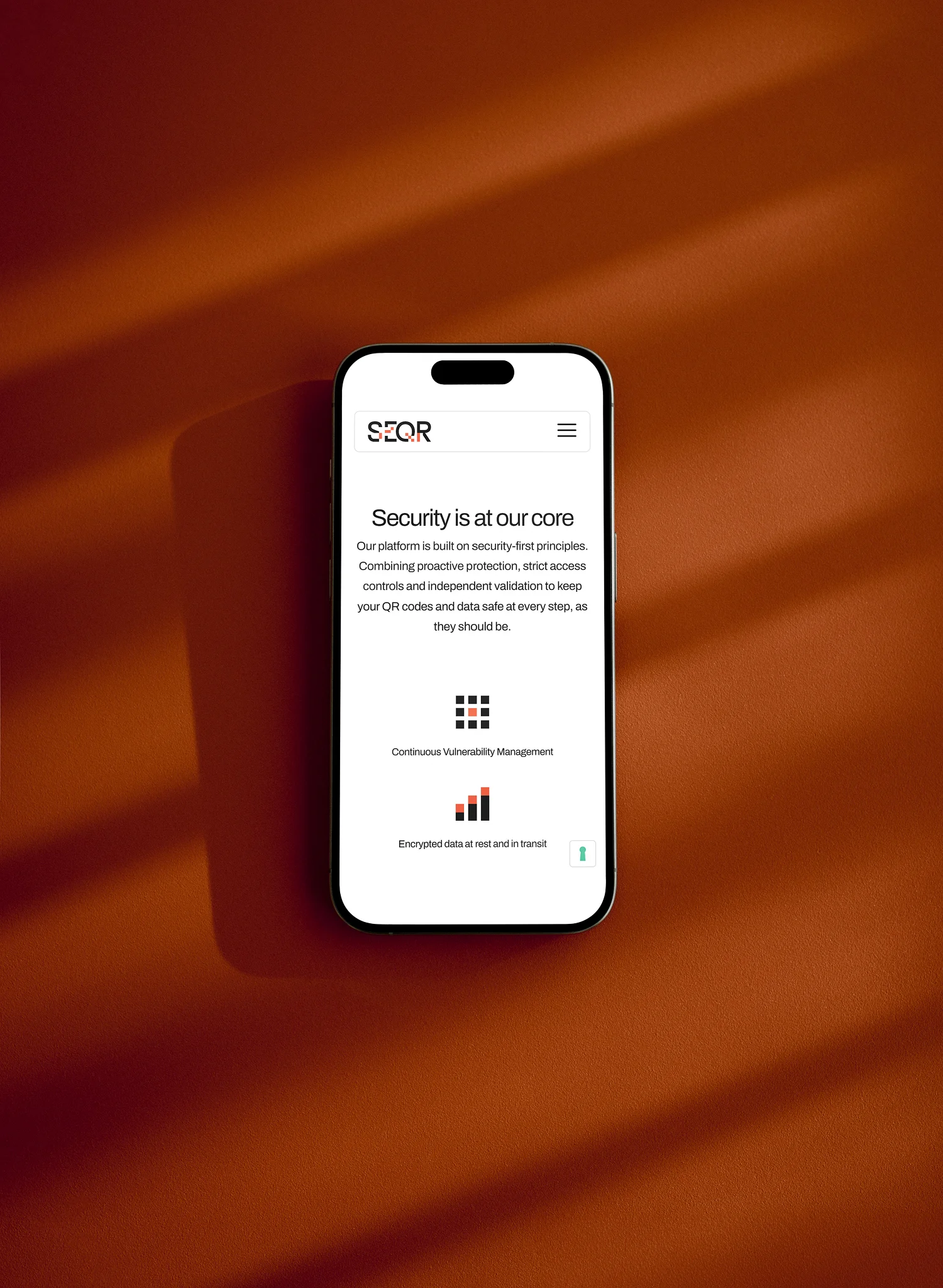
Working alongside Made With Syrup, the SEQR project focused on refining and elevating an existing SaaS website experience rather than redesigning it from scratch. While the visual foundation was already strong, the site lacked the level of polish, interaction consistency, and responsive refinement expected from a modern premium SaaS platform. The refresh involved improving layout systems, responsive behaviour, interaction design, mobile UX, and conversion-focused touchpoints throughout the website. Built and refined in Webflow, the project introduced a more cohesive interaction language through scroll-based animations, refined pricing interactions, reusable CTA sections, and smoother responsive behaviour — helping SEQR feel more polished, engaging, and product-focused across both desktop and mobile.

The project centred around improving the quality and consistency of an existing Webflow build. Rather than rebuilding sections entirely, the work focused on refining component behaviour, spacing systems, responsive layouts, and interaction patterns throughout the website. This approach allowed the platform to retain its established visual identity while significantly improving the overall user experience.
A range of interaction enhancements were introduced, including improved hover states, animated transitions, feature highlights, pricing interactions, and responsive behaviours. Combined with careful mobile optimisation and layout refinements, these improvements helped create a more polished and premium experience that better reflected the quality of the SEQR platform itself.
The challenge was improving the website without undermining the work that had already been completed. The existing design direction was strong, but small inconsistencies across responsiveness, interactions, and component implementation were creating friction throughout the experience. Any improvements needed to feel natural and integrated rather than introducing unnecessary complexity.
The solution was to approach the project as a systematic refinement exercise. By focusing on interaction quality, responsive behaviour, and consistency across the site, the overall experience was elevated while preserving the strengths of the original design. The result was a cleaner, more engaging platform that felt more aligned with modern SaaS expectations while remaining easy to manage and maintain.